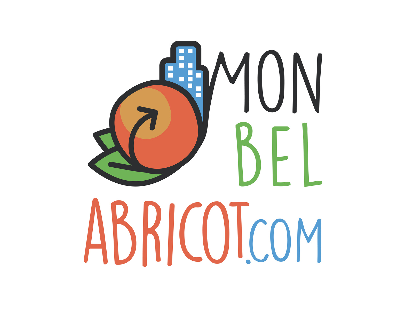
Mon Bel Abricot: a logo for an artisan brand
Creating the Mon Bel Abricot logo. A warm identity combining illustration and typography for an artisan brand.
Context
Mon Bel Abricot (“my beautiful apricot”) is an artisan brand that puts authenticity and craftsmanship at the heart of its identity. In a market where artisan products compete on promises of naturalness, the brand needed a logo that would not simply declare its craft but show it. The identity had to breathe warmth, handmade work and attention to every detail.
Issues identified
Visual authenticity: creating an identity that communicates the artisan character without falling back on the generic codes of the segment
Warmth and closeness: conveying a warm feeling through the logo, the opposite of cold corporate identities
Versatility: allowing use across varied media, from the product label to digital
Creative approach
The creative direction naturally steered the project towards illustration, drawing on hand-drawing skills acquired at the Beaux-Arts, the French fine art school.
1. Illustration work
The fruit, the apricot, was the obvious starting point. The illustration work set out to capture:
- The roundness and generosity of the fruit in an organic, living line
- A hand-drawn style, deliberately imperfect, that evokes the artisan’s gesture
- A level of detail rich enough to create visual interest without harming legibility when scaled down
2. Typographic pairing
The typeface was chosen to extend the handwritten character of the illustration:
- A typeface with soft letterforms, suggesting handwriting
- A balance between legibility and personality
- A harmonious fit with the illustration, so that the two form an inseparable whole
3. Colour palette
The colours were selected from a warm, natural range drawn directly from the fruit and its surroundings: oranges, ochres and soft greens that anchor the brand in a coherent sensory world.
Results
- A logo-illustration that is immediately warm and memorable
- An identity that stands apart from the minimalist approaches dominating the artisan sector
- A visual system that carries from the label to the web without losing its character
Impact
The Mon Bel Abricot logo demonstrates the value that genuine illustration work adds when building a brand identity. Where a standard vector pictogram would have produced yet another interchangeable artisan identity, drawing brings a singularity and a warmth that geometry alone cannot offer.