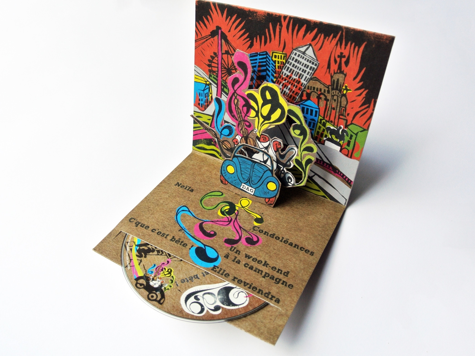
DAG album: art direction and linocut printing
Art direction for a music album. A linocut sleeve, editorial design and a handmade visual identity.
Context
DAG, a musician and composer, was preparing the release of a CD album and was looking for art direction that matched his musical world: organic, textured, deeply rooted in the physical gesture. In a landscape where music is losing its physical form and where sleeves are shrinking to digital thumbnails, the project carried the opposite ambition: to make the physical object a work in its own right, inseparable from the music it holds.
Issues identified
Distinctiveness: Standing apart from generic sleeves produced from digital templates
Artistic coherence: Giving visual form to a singular musical world
A physical object: Giving people a reason to own the CD in the age of streaming
Technical constraints: Adapting handmade work (linocut) to the demands of industrial printing
Creative approach
This project drew on craft learned at fine art school, applied to a piece of commercial communication. Linocut, a relief printing technique cut into linoleum, was chosen as the main medium for its raw texture and its one-of-a-kind character.
1. Artistic research
The work began with a phase of visual exploration fed by listening to the album:
- Translating the moods of the recording into graphic directions
- Looking for references in the history of printmaking and illustration
- Defining a visual vocabulary specific to the project: bold marks, strong contrast, organic textures
2. Cutting and printing
The handmade production process ran through several stages:
- Preparatory drawing and transfer onto the lino block
- Cutting with a gouge, direct carving in which every mark is irreversible
- Inking and pulling prints on the press, then selecting the most successful proofs
- High-resolution scanning and digital clean-up to prepare the print files
3. Editorial design and packaging
Beyond the sleeve, the whole package was carefully designed:
- A pop-up design built into the case, adding a tactile, playful dimension as it opens
- Layout of the booklet with hand-drawn lettering
- A coherent typographic system, between engraved-looking letterforms and a readable text face
- Song lyrics and credits treated in the spirit of the linocut
Results
1. Creative recognition
- 809 views on Dribbble, the most viewed project in the portfolio
- Clear interest from the design community in the handmade approach
- A project regularly cited as an example of unconventional art direction
2. A singular object
- A sleeve that stands out immediately through its material and its character
- Pop-up packaging that creates a moment of discovery as it opens
- An object you keep, handle and show, beyond simply listening to the music
3. Music and image in step
- A visual identity in direct resonance with the artist’s sonic world
- Graphic continuity from the booklet to the sleeve, from the CD to the promotional material
- Art direction that can be extended to the artist’s future projects
Impact
This project holds a particular place in the portfolio. It shows how a fine art education and a command of craft techniques can feed commercial communication work. Here, linocut brings what no digital filter can reproduce: controlled imperfection, the texture of the hand, the singularity of every cut mark. In a world saturated with smooth images, this album proves that craft remains the best way to create a memorable object.