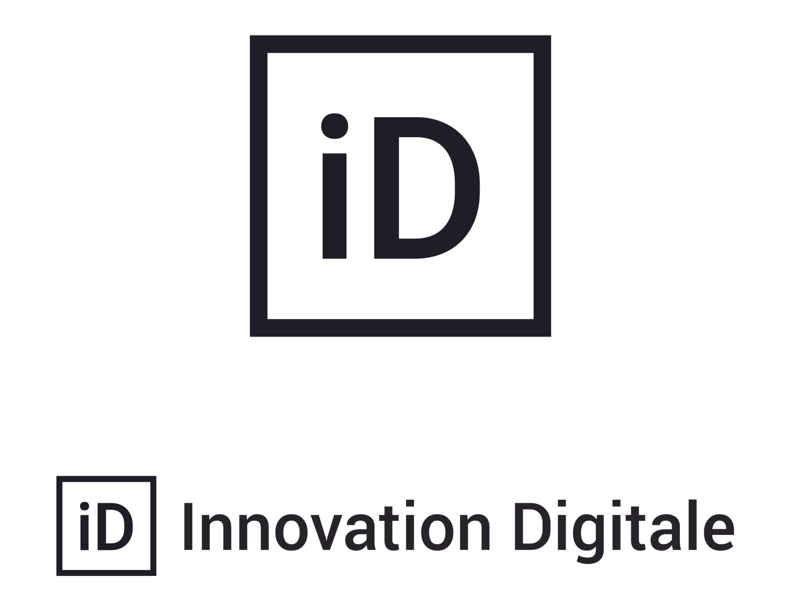
Innovation Digitale: brand identity for a consultancy
Designing a minimalist visual identity for a digital transformation consultancy. From the name to the logo, clear positioning in a saturated market.
Context
A digital transformation consultancy was looking to position itself in a particularly crowded market. The challenge was a serious one: how do you stand out when the word “innovation” — the very word the firm carries in its name, Innovation Digitale — has become a commonplace of business vocabulary? The firm needed an identity that would rise above that overused term and genuinely embody a distinctive vision of digital transformation consulting.
Issues identified
Works across media: the identity had to work equally well on presentation slides, on business cards and on a website
Premium positioning: it had to convey a high-end image consistent with the firm’s pricing
Creative approach
The creative work was built on strategic research before any graphic production began.
1. Strategic analysis of the name
Rather than trying to replace the name, the approach was to give it substance again through design:
- An audit of competing identities in the digital consulting market
- Identifying the dominant visual codes to avoid (blue gradients, abstract technology shapes)
- Defining a differentiating graphic territory: minimalist rigour
2. Logo design
The design process favoured stripping things back:
- A minimalist vector logo, built on a strict geometric grid
- A contemporary sans-serif typeface, chosen for its legibility and its elegance
- A restrained palette that helps the brand stand out on professional materials
- A pared-back graphic mark that works at every size, from favicon to roll-up banner
3. Visual system
A complete brand kit was produced to support the firm in its day-to-day work:
- Templates for sales presentations
- Layouts for proposal documents
- Versions for the web and social media
- Usage rules to guarantee consistency over time
Results
1. A distinctive identity
- A logo that stands out immediately in the consulting landscape
- Graphic restraint that reinforces the message of competence
- A recognisable, memorable visual system
2. Professional positioning
- An image aligned with what decision-makers and senior management expect
- Consistent, carefully crafted communication materials
- Greater credibility during business development
3. Operational effectiveness
- Templates the consultants can use directly
- A brand guide that is simple to apply without design skills
- An identity that can adapt as the firm evolves
Impact
This project shows how rigorous design work can turn an unremarkable positioning into a singular identity. By taking minimalism as its guiding principle, the Innovation Digitale identity proves that distinction does not come from accumulation but from precision. The firm now has a solid base on which to build its reputation in a demanding market.