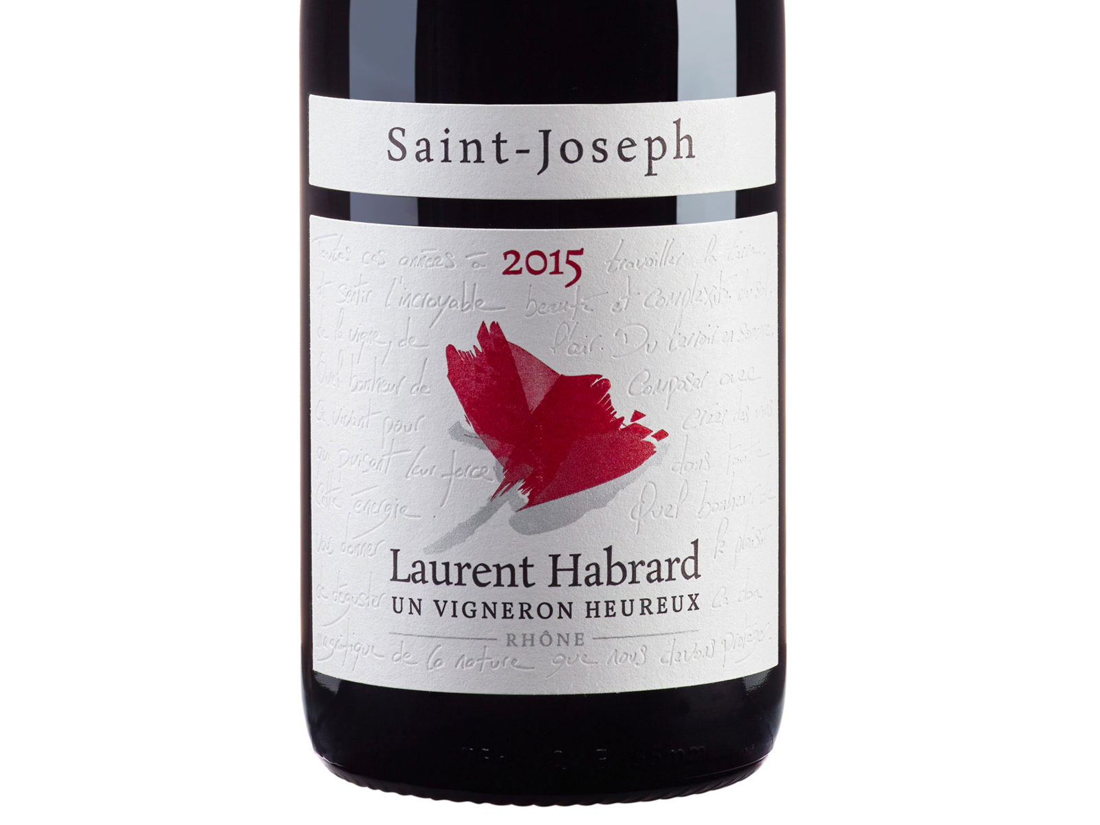
French Wine: label design and wine estate identity
Visual identity and label design for a French wine domaine. A balance between tradition and modernity.
Context
A French wine domaine wanted to modernise its image to win new markets, in export in particular and among a younger clientele. The domaine’s heritage, its grape varieties and its terroir were undeniable assets, but the way the bottles were dressed no longer reflected the ambition of the house. The challenge was clear: move on without disowning the past.
Issues identified
Tradition vs modernity: Respecting the winemaking heritage while offering a contemporary image
Competition on the shelf: Standing out among hundreds of other bottles on the shelf
Export markets: Creating an identity that reads internationally, in the English-speaking markets in particular
A coherent range: Extending the identity across several cuvées while differentiating each one
Creative approach
The creative work began with an immersion in the domaine’s world of wine, its codes and its constraints.
1. Research and conventions
A thorough study of the sector’s conventions fed the thinking:
- Analysis of trends in wine label design (minimalism, illustration, typography)
- Identifying the codes of French wine that cannot be ignored abroad
- Spotting opportunities to differentiate in a heavily codified sector
- A review of the regulatory constraints specific to wine labelling
2. Illustration and typography
The creative decision leaned towards illustration and hand-drawn lettering:
- Illustrated elements drawn by hand, evoking the vigneron’s manual work
- A pairing of typefaces: a classical serif to anchor the label in tradition, a contemporary one for modernity
- A colour palette drawn from the tones of the terroir and the seasons of the vineyard year
- A play of textures and papers reinforcing the sensory dimension of the label
3. A label system
A modular system was designed to cover the whole range:
- A shared graphic structure ensuring the brand is recognised
- Variations in colour and illustration to differentiate each cuvée
- A back label designed to tell the story of the wine and of the domaine
- The capsule and cork dressing folded into the overall thinking
Results
1. Impact on the shelf
- Labels that catch the eye on a crowded shelf
- An identity recognisable at first glance
- A premium perception reinforced by the choice of materials and finishes
2. Market reception
- Positive feedback from distribution partners, in France and in export markets
- An image the target customers read as authentic and contemporary
- Coherence between the domaine’s positioning and its visual expression
3. A system built to last
- Brand guidelines that allow new cuvées to be added without a redesign
- An identity adaptable to special formats (magnums, gift boxes)
- A solid basis for developing the domaine’s digital communication
Impact
This project shows that considered design work can reconcile heritage and contemporary taste. A wine label is not mere dressing: it is the domaine’s first ambassador, the one that has to convince in a few seconds on a shelf. By combining handmade illustration and typographic rigour, this winery identity manages to tell a story of terroir in a current visual language.