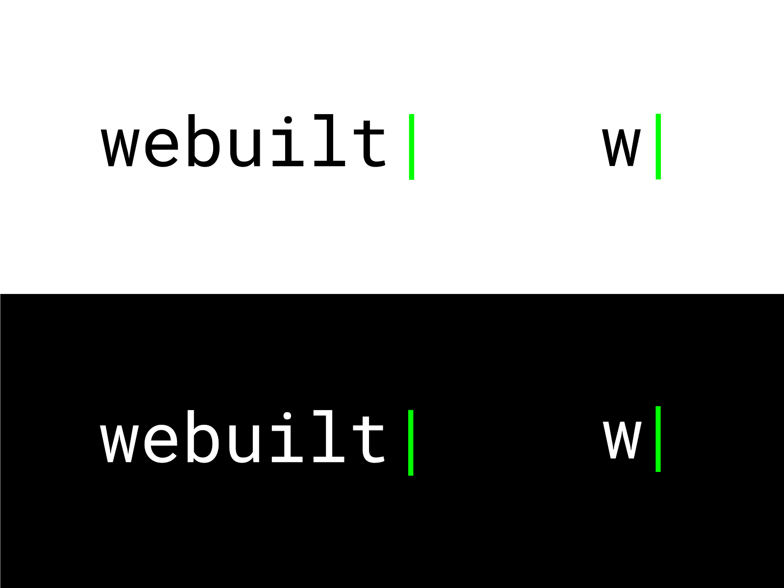
Webuilt: a logo for a web development agency
Creating the Webuilt logo for a web development agency. An iconic mark that fuses the letter W with the idea of digital construction.
Context
Webuilt is a web development agency whose name already carries a promise: to build. The challenge was to express that double reading visually – web and built, “we built” – in a logo capable of working both as a brand signature and as a favicon in a browser tab.
Issues identified
Visual semantics: fusing the ideas of construction and web technology into a single mark
Adaptability: designing a system that works in a full version (logo + type) and in a reduced version (icon alone)
Positioning: asserting a professional, modern image in a sector saturated with web agencies
Creative approach
The creative direction moved towards designing an icon that treats the letter W as architectural raw material.
1. Conceptual exploration
The research looked at the points where architectural forms and the letter W converge. The idea of assembled building blocks emerged as the truest metaphor for the developer’s work: putting components together to build a coherent whole.
2. Designing the icon
The design process followed several steps:
- Breaking the letter W down into elementary geometric shapes
- Assembling those shapes according to a building-block logic
- Flat vector design guaranteeing optimal legibility at small sizes
- Work on the proportions for a balanced result as a favicon
3. Typographic system
The icon was paired with a modern sans-serif typeface, chosen for its neutrality and its legibility. Together they form a coherent system usable across all of the agency’s communication materials.
Results
- A logo-icon that reads immediately both as a W and as a construction
- A distinctive favicon in the navigation bar
- A professional identity that stands out from generic web agency logos
Impact
The Webuilt logo shows that rigorous graphic synthesis can condense an entire positioning into a simple mark. The successful fusion of letter and concept gives the agency a memorable visual signature that carries meaning.