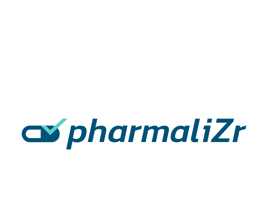
Pharmalizr: visual identity for a healthcare software publisher
Creating the brand identity and logo for Pharmalizr, a medicine serialisation solution. Credible positioning in the tightly regulated healthcare sector.
Context
Pharmalizr is the flagship product of Eirwego, a specialist in medicine serialisation. In a pharmaceutical sector governed by strict regulation, not least the European Falsified Medicines Directive, the company needed a visual identity to match its ambitions. The software makes it possible to trace every box of medicine from production to the moment it is dispensed in the pharmacy, a major public health issue.
Issues identified
Regulatory credibility: inspiring confidence in health authorities and pharmaceutical laboratories
A dual nature: reconciling the technology world of SaaS with the reassuring codes of the healthcare sector
Technical legibility: making a complex subject (serialisation, traceability, compliance) accessible through a clear identity
Product consistency: aligning the brand identity with the software’s user interface
Creative approach
Creating the Pharmalizr visual identity revolved around a search for balance between rigour and modernity.
1. Research and positioning
Analysis of the market revealed a landscape dominated by identities that were either too clinical or too generic. The opportunity lay in creating a brand that communicates technological precision and the reliability expected in healthcare at the same time.
2. Logo design
The design process was structured around several strands:
- Exploring pharmaceutical colour codes: deep blues, medical greens, clinical whites
- Typographic work on a modern sans-serif typeface suggesting precision
- Bringing in symbolic elements linked to traceability and serialisation
- Looking for a distinctive mark that works at small sizes (favicon, interface)
3. Brand system
Beyond the logo, a complete visual system was developed to support the roll-out of the brand across every medium: technical documentation, sales presentations, the software interface and regulatory communication materials.
Results
1. An identity adopted
- The brand deployed across every touchpoint
- Visual consistency between the software, the website and the sales materials
- Versions adapted to the constraints of regulatory documents
2. Greater credibility
- A professional image aligned with the demands of the pharmaceutical sector
- An identity seen as reliable by institutional counterparts
- Clear positioning in the serialisation market
3. A lasting foundation
- A visual system that can evolve as the product grows
- A brand guide adaptable to future additions to the Eirwego range
- A solid base for training and documentation materials
Impact
This identity work demonstrates how important rigorous branding is in regulated sectors. The Pharmalizr visual identity does more than dress up a product: it plays an active part in the credibility of the solution with laboratories and health authorities, a decisive commercial asset in a market where trust is the first criterion of choice.