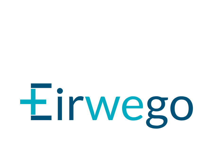
Eirwego: visual identity for a software company
Creation of the logo and visual identity for Eirwego, a software company serving the pharmaceutical industry.
Context
Eirwego is the software company behind Pharmalizr, its medicine serialisation solution. The company needed a corporate identity distinct from that of its flagship product. The challenge: to embody the technology parent company while keeping a credible family link with the product brand already in place.
Issues identified
Corporate distinction: Clearly separating the company’s identity from that of its product
A controlled family link: Keeping a coherent visual link between Eirwego and Pharmalizr without conflating the two
Institutional trust: Projecting an image of solidity to the partners, investors and institutional clients of the pharmaceutical sector
Creative approach
The Eirwego identity was designed in direct relation to the work done on Pharmalizr, to guarantee overall coherence without redundancy.
1. Brand positioning
The analysis looked at the relationship between corporate brand and product brand in the software ecosystem. Eirwego had to position itself as the technology and strategy entity, while Pharmalizr carries the business and regulatory dimension. That distinction guided every creative decision.
2. Designing the logo
The design process was structured around several areas:
- Searching for a mark that suggests technology and precision without falling back on the sector’s clichés
- Vector construction on a grid, with pared-back lines and clean shapes
- A colour palette complementary to Pharmalizr’s, without duplicating it
- A corporate typeface asserting the institutional dimension of the brand
3. Brand architecture
A brand architecture exercise set the rules for how Eirwego and Pharmalizr coexist: hierarchy of the logos, joint usage, variants for each medium. That framework keeps the ecosystem legible for outside audiences.
Results
- A standalone corporate identity, immediately distinguishable from the product brand
- A clear system for the two levels of brand to coexist
- A solid institutional image suited to negotiation and partnership settings
Impact
The Eirwego identity illustrates a common challenge in the software world: giving visual structure to the relationship between a software company and its products. Working on both brands in parallel made it possible to build a coherent visual ecosystem, where each entity finds its place without encroaching on the other.